Free trials look simple, but the decision to pay rarely comes at the end. Most users decide whether the product is worth any future attention during their very first session. That moment is where conversion is won or lost. It has less to do with trial length and far more to do with how quickly users reach value.
A strong free trial gives people momentum. It helps them understand why the product matters before friction takes over. Teams that do this well do not rely on aggressive follow-up campaigns. They rely on thoughtful sequences, intuitive onboarding, and a guided path that leads users to their first meaningful outcome.
This article breaks down what high-performing SaaS trials actually do differently and uses real examples to show the patterns behind consistently strong conversion rates.
Why Free Trial Conversion Matters More Than Ever
Free trial conversion is one of the clearest signals of product quality and activation strength. Most SaaS companies sit in the 10 to 25 percent conversion range, but teams with strong product-led processes regularly push well above 30 percent. The difference rarely comes from better sales tactics. It comes from a cleaner first experience.
Most users never return after their first interaction. This means the trial’s success does not depend on how long it lasts. It depends on how quickly your product demonstrates value. A long trial cannot compensate for a slow start, while even a short trial can convert if users feel progress early.
A healthy trial-to-paid rate shows that your product communicates its value without needing explanations, demos, or persuasion.
Real SaaS Free Trial Examples Worth Studying
Studying real companies makes these principles clearer. The best examples come from products that turned activation into a deliberate part of their growth strategy.
Notion: Zero friction from the start
Notion loads users directly into a usable workspace. There are no lengthy tours and no pressure to understand everything. The product encourages action through simplicity. Users understand the value by building something immediately.
Key takeaway: remove unnecessary layers between the user and the first meaningful interaction.
Figma: Collaboration as the core activation event
Figma introduces users to the canvas instantly. The moment a user drags, edits, or creates something, the product becomes intuitive. Inviting a collaborator elevates the experience even further.
Key takeaway: show your product’s magic early by letting users experience it directly.
Ahrefs: Real data in the trial
Ahrefs provides full, real search data during the trial. Users do not see placeholders or theoretical metrics. They see insights that apply to their own site, which makes the value impossible to ignore.
Key takeaway: offer meaningful data or output during the trial, not limited samples.
Loom: Activation through immediate output
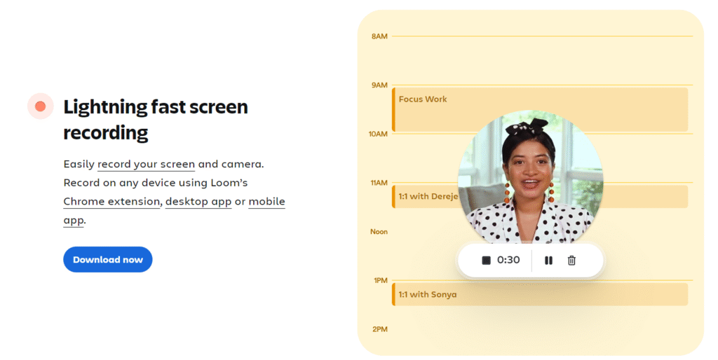
Loom focuses everything on the first recording. A user clicks “Record,” speaks for a moment, and instantly receives a video. The product delivers value through the act of creation.
Key takeaway: help users produce something useful as soon as possible.
What These Examples Reveal About High-Performing Trials
These products succeed because they make the path to value feel simple and intentional. Nothing about their success is accidental. Strong trials remove uncertainty by making the next step easy to spot.
Users do not have to guess where to click or what to try first. The product subtly guides them toward a meaningful outcome that shows why it matters.
They also avoid overwhelming users with long tours or exhaustive explanations. Instead, they offer small, timely pieces of guidance that appear when the user actually needs them. This keeps the experience supportive without feeling restrictive. Value shows up early, long before someone understands every feature. A single useful action or quick win is often enough to build trust.
Follow-ups reinforce this momentum by responding to what users have already done. When messages feel relevant, the trial feels more personal and less scripted.
Improving conversion does not require a full redesign. It starts with identifying the one action that proves the product’s value and making sure users reach it quickly. Removing unnecessary steps, adding simple nudges, and smoothing early friction can have an immediate impact.
A short, focused activation sequence helps users return, while analytics reveal where they get stuck. Fixing these moments often produces the biggest gains. When the journey is clear and value appears early, trial users naturally move toward becoming paying customers.
What High-Converting SaaS Free Trials Have in Common
Although products differ, the trials that consistently perform well follow the same underlying principles. They guide the user toward progress without creating cognitive load.
Fast and clear moments of first value
The strongest free trials help users accomplish something meaningful within minutes. Users do not want to learn every feature. They want one clear win that proves the product is worth exploring. High performers make this moment easy to reach by removing unnecessary steps.
Onboarding paths designed to reduce friction
Lengthy forms and complex setup screens slow down the trial. High-converting trials prioritize smooth entry, simplified choices, and fewer interruptions. Progress feels intuitive and forward-moving, not heavy or confusing.
Guidance that adapts to user behavior
Static tutorials rarely help because they do not match the user’s timing. Modern trials guide users based on what they actually do. A prompt appears when a user hesitates. A suggestion appears after they complete a step. The guidance feels timely instead of generic.
Activation messages that reinforce momentum
The best trials use short, targeted messages during onboarding, inside the product, and via email. These messages encourage progress, offer help at the right moments, and acknowledge achievements. They feel like support, not marketing.
A Simple Framework for Running Trial Experiments
A structured approach helps you improve the trial without creating chaos or confusion.
Observe the first five minutes of real user behavior
This is the most revealing part of the journey. You will quickly notice where people hesitate, get confused, or lose interest.
Identify precise moments where progress stops
Hesitation points are often the biggest conversion threats. These moments tell you where users need guidance or simplification.
Design small, targeted interventions for those moments
Interventions can be simple, such as improving a label, adjusting a prompt, or changing the order of actions. These small changes often create disproportionate gains.
Test one improvement at a time
Clear experiments make it easy to understand what genuinely increased conversion. Overlapping changes hide results.
Final Thoughts
Free trials succeed when users feel early progress and understand why the product matters. They fail when the first steps feel heavy, unclear, or disconnected from real value. Companies with high conversion rates do not overwhelm users with features or tutorials. They offer a guided path that helps people achieve something meaningful quickly.
A strong free trial is not a preview. It is an experience designed to communicate value. When that value appears early and naturally, the decision to upgrade feels easy, not forced.