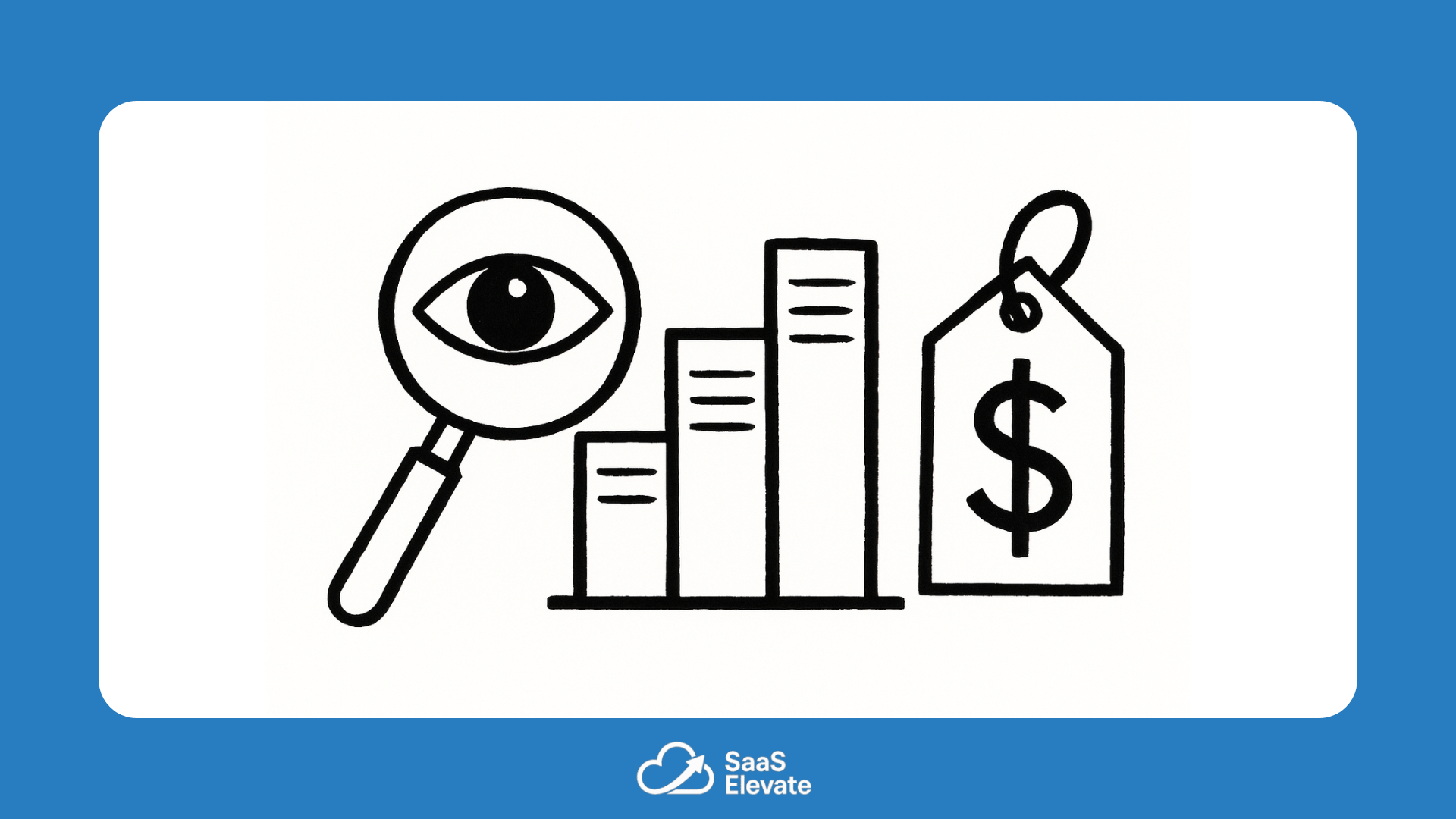
Pricing is never just about numbers. It’s about how people perceive value, risk, and fairness. In SaaS, where customers rarely pay upfront and can leave anytime, psychology often matters more than pure math. The right pricing structure can make your product feel like an easy decision. The wrong one can make even great software feel expensive.
SaaS pricing isn’t a spreadsheet problem. It’s a storytelling problem. Each tier tells users who the product is for, what success looks like, and how much ambition costs.
Why Three Tiers Work So Often
Most SaaS products end up with three pricing tiers for a reason. It’s not random. People tend to compare options rather than evaluate them in isolation. When you give them three choices, they naturally focus on the middle one. It feels safe, balanced, and rational.
This is called the “compromise effect.” It’s the reason most users avoid the cheapest plan, which feels limited, and skip the most expensive one, which feels excessive. The middle tier becomes the default choice — not because it’s objectively best, but because it feels right.
For founders, that means the middle plan isn’t just another pricing level. It’s your true flagship. Design it with care, because most customers will end up there.
Anchoring and Perceived Value
The first price a customer sees becomes their reference point. If your highest plan is €299, the €99 plan suddenly feels affordable. Without that anchor, €99 can seem like a big jump. This is why successful SaaS companies rarely hide their top pricing tier. It’s not there to sell volume. It’s there to make everything else look more attainable.
Anchoring also works in reverse. If you start with a free or low-cost plan, upgrading later can feel expensive, even when the math makes sense. That’s why it’s important to introduce the full pricing range early, so users can mentally place themselves on the value ladder.
The Power of Naming
Words change how people interpret price. “Starter” sounds limited but friendly. “Pro” sounds confident and capable. “Enterprise” signals control and reliability. These labels do more than describe features — they shape identity. When someone buys a “Pro” plan, they’re not just getting more features. They’re aligning with a self-image.
Good pricing names make users feel like they’re choosing a level of maturity, not just a product version.
Trial vs. Commitment
Free trials lower the barrier to entry, but they also reset expectations. When users don’t pay immediately, they subconsciously assign less value to what they’re trying. That’s why conversion from trial to paid often depends on perceived progress during the trial itself.
If users achieve something meaningful within the free period — publish a report, launch a campaign, complete setup — they’re more likely to convert. The trial becomes proof of value rather than just a test drive.
Balancing Logic and Emotion
The best pricing pages respect both logic and emotion. Numbers should make sense, but layout, color, and phrasing shape the decision. Highlighting one tier, showing savings for annual billing, or using visual contrast are not cosmetic tricks. They’re cues that guide attention.
At its core, pricing is communication. It’s how you say, “This is what we’re worth, and this is who we’re for.” When done well, pricing builds confidence. When done poorly, it raises doubt before the product even has a chance to prove itself.
Pricing Is a Conversation, Not a Decision
There is no perfect pricing model. Markets change, competitors evolve, and user expectations shift. Treat pricing as a living part of your product, not a one-time decision. Talk to customers. Watch upgrade patterns. Adjust the narrative around value, not just the numbers on the page.
In the end, great pricing is about trust. It’s the moment when the customer decides that what you offer is worth more than what they pay. And that decision is always emotional first, rational second.

